|
|
Post by unafied on Aug 5, 2022 10:50:55 GMT -6
I went ahead and shot off an email. I want to compare it to voting: if you don't do it, you sort of forfeit your right to complain.
The lion head logo will be fine. I don't think a change was necessary, but in time I'll likely get over it. However it needs gold, period.
I don't see myself ever buying any merchandise with the "NA". Without the U, that's an acronym that really carries no meaning for me personally.
|
|
|
|
Post by roaringsince96 on Aug 5, 2022 17:59:24 GMT -6
I do not even like the new logo for my phone app. Yuck. Purple and gold all the way. Not a fan of the yellow, white or black. Hopefully someone will make the right decision. Being full blown D1 doesn’t mean forgetting who you are or where you came from. I get the excitement, but the oldest 4 year university in Alabama doesn’t need a drastic change.
|
|
|
|
Post by tuna85 on Aug 5, 2022 18:17:33 GMT -6
I went ahead and shot off an email. I want to compare it to voting: if you don't do it, you sort of forfeit your right to complain. The lion head logo will be fine. I don't think a change was necessary, but in time I'll likely get over it. However it needs gold, period. I don't see myself ever buying any merchandise with the "NA". Without the U, that's an acronym that really carries no meaning for me personally. Agree with you on the lion head logo. Doesn't overwhelm but I reckon it'll grow on me over time. Really liked the old one. Kind of like old reminded me of Mufasa and new reminds me of Scar. |
|
|
|
Post by unalions on Aug 6, 2022 12:54:05 GMT -6
I like the one on the purple background better. Just need to work that sand gold into the lion head.
|
|
|
|
Post by unafied on Aug 7, 2022 17:18:15 GMT -6
Saw this on Twitter. I have to admit, I don’t hate them (though there’s still too much white). However, the guy did a concept with the “NA” logo and it’s just brutally bad. I still cannot fathom how someone was paid to design that.
|
|
|
|
Post by unalions on Aug 8, 2022 8:42:04 GMT -6
Saw this on Twitter. I have to admit, I don’t hate them (though there’s still too much white). However, the guy did a concept with the “NA” logo and it’s just brutally bad. I still cannot fathom how someone was paid to design that. Looks better in an oval vs. a circle, that’s for sure. |
|
|
|
Post by unafied on Aug 8, 2022 9:24:14 GMT -6
The purple helmet with the gold/white/gold stripe (bottom right) would work well as a main helmet. I could dig it.
If we do go with just the lion head on the side, it's basically an updated version of what we wore in the late Hudspeth era, and maybe into the Bowden years? Those helmets were that strange dark purple (almost navy) with the previous lion head in white. I hope we don't get rid of the "leaping lion" helmets like in my avatar, but I have a bad feeling that they will. I think they'll really want to push this new logo. I bet we see some variation of the helmets above on the field this year.
|
|
|
|
Post by brandon on Aug 8, 2022 10:27:08 GMT -6
I got a feeling the NA will be on the helmet...
That's the only on that North Alabama Football Twitter account liked....
|
|
|
|
Post by una04 on Aug 8, 2022 15:36:13 GMT -6
I got a feeling the NA will be on the helmet... That's the only on that North Alabama Football Twitter account liked.... Call me crazy, but I kind of like the NA on the helmet. Sure wish it had some Gold though. |
|
|
|
Post by brandon on Aug 8, 2022 16:40:15 GMT -6
I got a feeling the NA will be on the helmet... That's the only on that North Alabama Football Twitter account liked.... Call me crazy, but I kind of like the NA on the helmet. Sure wish it had some Gold though. I feel the same way about the logo in general. I'll be honest, I've accepted the lion logo (old one) but it's just a spin off of Penn State and Mizzu. Our original lion head that was not in a oval was much better in my opinion. |
|
|
|
Post by unafied on Aug 8, 2022 17:59:34 GMT -6
Call me crazy, but I kind of like the NA on the helmet. Sure wish it had some Gold though. I feel the same way about the logo in general. I'll be honest, I've accepted the lion logo (old one) but it's just a spin off of Penn State and Mizzu. Our original lion head that was not in a oval was much better in my opinion. Talking about this one?  |
|
|
|
Post by unafied on Aug 8, 2022 18:06:22 GMT -6
Kinda pointless to even post this, and I probably shouldn’t, but… in Googling our history I actually saw a school in Nashville that has a logo that made me a bit jealous. Nails the colors, obviously.  |
|
|
|
Post by brandon on Aug 8, 2022 18:19:43 GMT -6
I feel the same way about the logo in general. I'll be honest, I've accepted the lion logo (old one) but it's just a spin off of Penn State and Mizzu. Our original lion head that was not in a oval was much better in my opinion. Talking about this one? Yep |
|
|
|
Post by unalions on Aug 8, 2022 18:45:29 GMT -6
Kinda pointless to even post this, and I probably shouldn’t, but… in Googling our history I actually saw a school in Nashville that has a logo that made me a bit jealous. Nails the colors, obviously. Love this! It reminded me that there’s a pro soccer team in Orlando with Lions as a mascot and our colors. 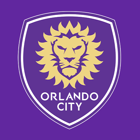 |
|
|
|
Post by unafied on Aug 9, 2022 5:52:07 GMT -6
Kinda pointless to even post this, and I probably shouldn’t, but… in Googling our history I actually saw a school in Nashville that has a logo that made me a bit jealous. Nails the colors, obviously. Love this! It reminded me that there’s a pro soccer team in Orlando with Lions as a mascot and our colors. I had forgotten about that Orlando team, but yeah... that's a good one as well. I think a big reason I prefer Vegas/sand gold is it resembling the actual color of a lion. I feel like we are going a "minimalist", or simplified direction in regards to our logos. But that design trend has been going on for years now and I wouldn't be surprised if things start moving in a different direction soon. |
|


